A palette is not just three swatches on a Pinterest board — it's the rule that keeps every florist, rental company, and stationer pulling in the same direction. Here's how to build one that works.
A wedding palette needs four colors, not three
Two neutrals (one warm, one cool), one anchor (your loudest color, used in florals and signage), and one accent (used sparingly in metals, ribbon, or candles). Three colors leaves your design flat; five starts to feel like a kid's birthday party.
Write the four hex values down. Every vendor gets the same swatch card. This alone solves 80% of the 'why does the linen not match the bridesmaid dress' problem.
Eight palettes we love
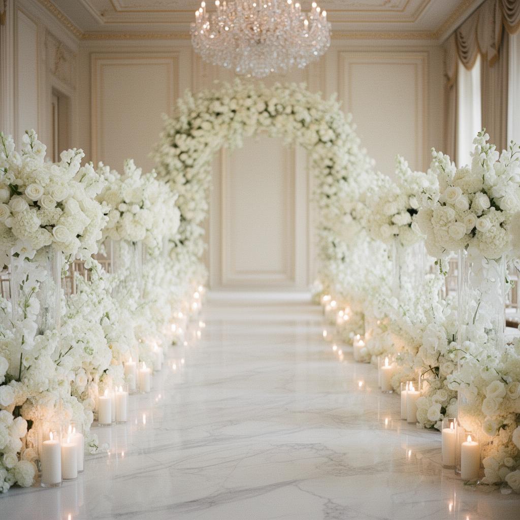
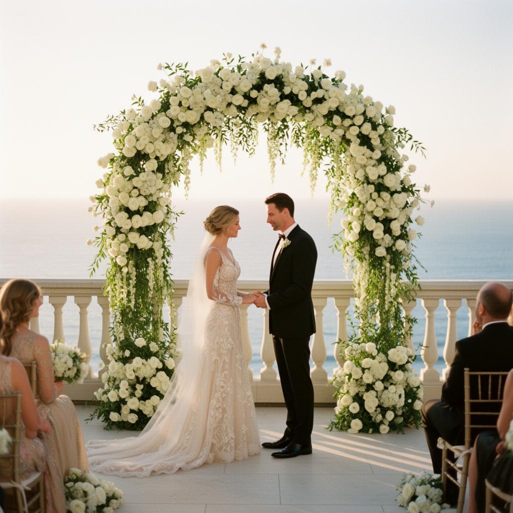
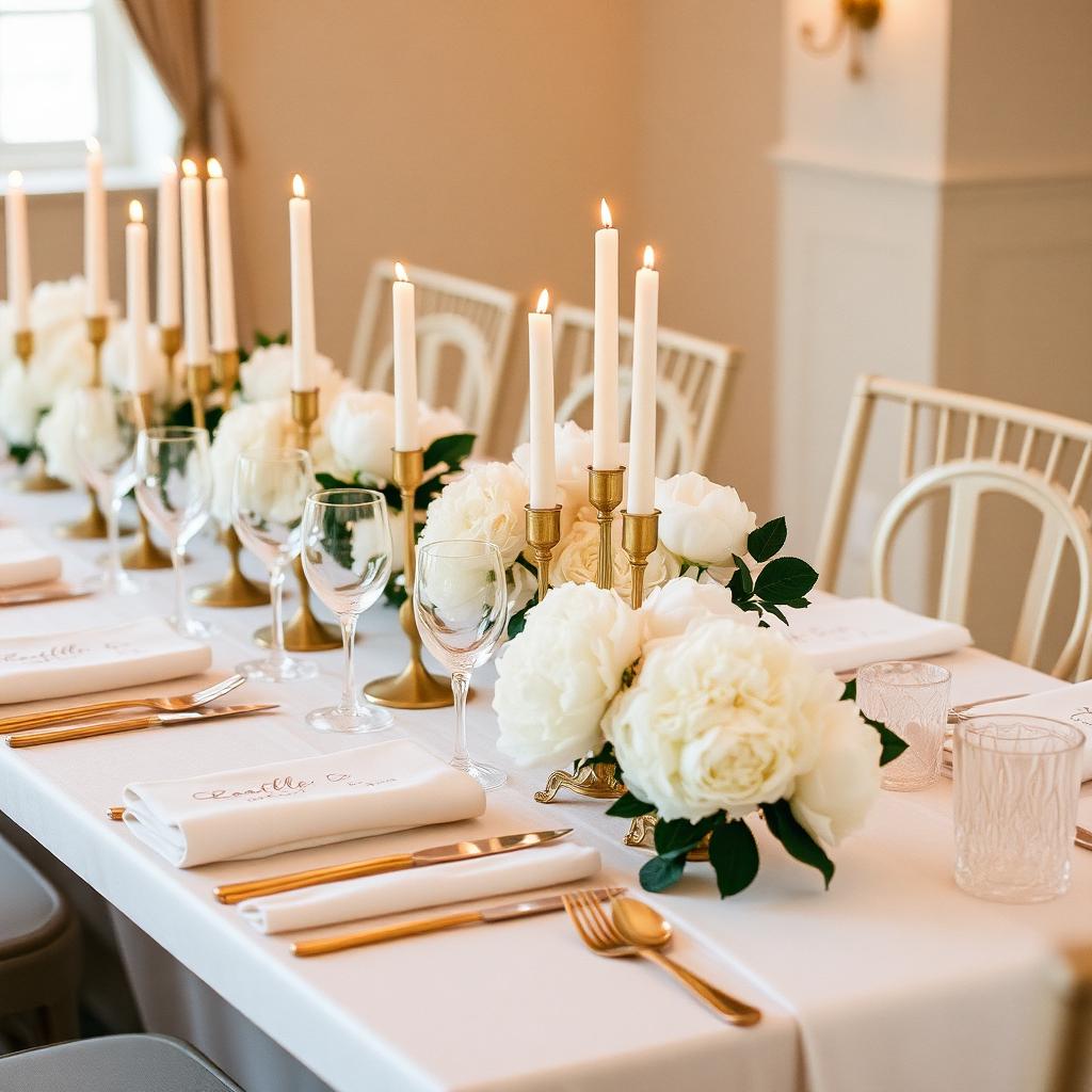
Ivory & Champagne — quiet luxury, candlelight, taper tapers, and the softest ivory linen.
Blush & Bone — garden roses, blush silks, ribbon-tied bouquets. Warm and romantic.
Sage & Cream — olive branches, taper candles, stoneware. Earthy without being rustic.
Noir & Gold — editorial and bold. Black tie, gold leaf, dramatic florals.
Mauve & Burgundy — moody and romantic. Plum florals, burgundy ribbon, gold flatware.
Dusty Blue & Silver — cool and elegant. Hydrangeas, silver candelabras, and crystal.
Terracotta & Rust — sun-warmed and rich. Desert blooms, rust silks, hammered brass.
Emerald & Ivory — jewel-toned and lush. Emerald velvet, ivory peonies, gold accents.
Match the palette to the venue's undertones
A ballroom with warm-gold chandeliers eats cool palettes alive — dusty blue reads gray under that lighting. A vineyard at 6pm turns everything gold, which flatters terracotta and blush and washes out pastels.
Look at the venue at the exact hour of your ceremony before you finalize the palette. If you can't visit, ask three past couples' photographers for a wide shot at that hour.
The Vibe Quiz
If you want a shortcut, our DIY kits include a palette worksheet and swatch cards you can hand straight to your florist and stationer — a good starting point before your first planner call.